[fusion_builder_container type=”flex” hundred_percent=”no” equal_height_columns=”no” menu_anchor=”” hide_on_mobile=”small-visibility,medium-visibility,large-visibility” class=”” id=”” background_color=”” background_image=”” background_position=”center center” background_repeat=”no-repeat” fade=”no” background_parallax=”none” parallax_speed=”0.3″ video_mp4=”” video_webm=”” video_ogv=”” video_url=”” video_aspect_ratio=”16:9″ video_loop=”yes” video_mute=”yes” overlay_color=”” video_preview_image=”” border_color=”” border_style=”solid” padding_top=”” padding_bottom=”” padding_left=”” padding_right=””][fusion_builder_row][fusion_builder_column type=”1_1″ layout=”1_1″ background_position=”left top” background_color=”” border_color=”” border_style=”solid” border_position=”all” spacing=”yes” background_image=”” background_repeat=”no-repeat” padding_top=”” padding_right=”” padding_bottom=”” padding_left=”” margin_top=”0px” margin_bottom=”0px” class=”” id=”” animation_type=”” animation_speed=”0.3″ animation_direction=”left” hide_on_mobile=”small-visibility,medium-visibility,large-visibility” center_content=”no” last=”true” min_height=”” hover_type=”none” link=”” border_sizes_top=”” border_sizes_bottom=”” border_sizes_left=”” border_sizes_right=”” first=”true”][fusion_text columns=”” column_min_width=”” column_spacing=”” rule_style=”” rule_size=”” rule_color=”” hue=”” saturation=”” lightness=”” alpha=”” user_select=”” content_alignment_medium=”” content_alignment_small=”” content_alignment=”” hide_on_mobile=”small-visibility,medium-visibility,large-visibility” sticky_display=”normal,sticky” class=”” id=”” margin_top=”” margin_right=”” margin_bottom=”” margin_left=”” fusion_font_family_text_font=”” fusion_font_variant_text_font=”” font_size=”” line_height=”” letter_spacing=”” text_transform=”” text_color=”” animation_type=”” animation_direction=”left” animation_color=”” animation_speed=”0.3″ animation_delay=”0″ animation_offset=”” logics=””]
HTML < div > Tag – Detailed Lesson Plan
Objective
By the end of this lesson, students will:
- Understand the purpose of the
< div > tag.
- Know how to use it for structuring HTML pages.
- Apply the
< div > tag effectively in web development for layout and styling purposes.
Lesson Outline
- Introduction to the
< div > Tag
- Basic Usage
- Styling with
< div > (CSS)
- Positioning and Layout using
< div >
- Nesting
< div > Elements
- Common Use Cases of
< div >
- Difference between
< div > and other HTML elements
- Final Assignment
- Answer Key
1. Introduction to the < div > Tag
The < div > tag is a block-level HTML element used to group and organize other elements. It doesn’t add any visible change on its own; rather, it’s used as a container to style, position, or manipulate groups of elements using CSS or JavaScript.
- Block-level: It starts on a new line and stretches to fill the width of its container.Example:
[/fusion_text][fusion_syntax_highlighter theme=”” language=”html” line_numbers=”” line_wrapping=”” copy_to_clipboard=”” copy_to_clipboard_text=”” hide_on_mobile=”small-visibility,medium-visibility,large-visibility” class=”” id=”” font_size=”” border_size=”” border_color=”” hue=”” saturation=”” lightness=”” alpha=”” border_style=”” background_color=”” line_number_background_color=”” line_number_text_color=”” margin_top=”” margin_right=”” margin_bottom=”” margin_left=””]PGRpdj5JJ20gYSBibG9jay1sZXZlbCBlbGVtZW50PC9kaXY+CjxwPlNvIGFtIEkhPC9wPg==[/fusion_syntax_highlighter][fusion_text columns=”” column_min_width=”” column_spacing=”” rule_style=”” rule_size=”” rule_color=”” hue=”” saturation=”” lightness=”” alpha=”” user_select=”” content_alignment_medium=”” content_alignment_small=”” content_alignment=”” hide_on_mobile=”small-visibility,medium-visibility,large-visibility” sticky_display=”normal,sticky” class=”” id=”” margin_top=”” margin_right=”” margin_bottom=”” margin_left=”” fusion_font_family_text_font=”” fusion_font_variant_text_font=”” font_size=”” line_height=”” letter_spacing=”” text_transform=”” text_color=”” animation_type=”” animation_direction=”left” animation_color=”” animation_speed=”0.3″ animation_delay=”0″ animation_offset=”” logics=””]
2. Basic Usage
In its simplest form, the < div > tag can be used to group content together.
Example 1: Simple Grouping
[/fusion_text][fusion_syntax_highlighter theme=”” language=”html” line_numbers=”” line_wrapping=”” copy_to_clipboard=”” copy_to_clipboard_text=”” hide_on_mobile=”small-visibility,medium-visibility,large-visibility” class=”” id=”” font_size=”” border_size=”” border_color=”” hue=”” saturation=”” lightness=”” alpha=”” border_style=”” background_color=”” line_number_background_color=”” line_number_text_color=”” margin_top=”” margin_right=”” margin_bottom=”” margin_left=””]PGRpdj4KICA8aDE+V2VsY29tZSB0byBNeSBXZWJzaXRlPC9oMT4KICA8cD5UaGlzIGlzIGEgcGFyYWdyYXBoIGluc2lkZSBhIGRpdiBjb250YWluZXIuPC9wPgo8L2Rpdj4=[/fusion_syntax_highlighter][fusion_text columns=”” column_min_width=”” column_spacing=”” rule_style=”” rule_size=”” rule_color=”” hue=”” saturation=”” lightness=”” alpha=”” user_select=”” content_alignment_medium=”” content_alignment_small=”” content_alignment=”” hide_on_mobile=”small-visibility,medium-visibility,large-visibility” sticky_display=”normal,sticky” class=”” id=”” margin_top=”” margin_right=”” margin_bottom=”” margin_left=”” fusion_font_family_text_font=”” fusion_font_variant_text_font=”” font_size=”” line_height=”” letter_spacing=”” text_transform=”” text_color=”” animation_type=”” animation_direction=”left” animation_color=”” animation_speed=”0.3″ animation_delay=”0″ animation_offset=”” logics=””]
Explanation: The < div > groups the heading and paragraph together, allowing us to later style or manipulate them as one entity.
3. Styling with < div > (CSS)
Although the < div > tag itself has no default visual styles, you can use CSS to style it.
Example 2: Styling a < div >
[/fusion_text][fusion_syntax_highlighter theme=”” language=”html” line_numbers=”” line_wrapping=”” copy_to_clipboard=”” copy_to_clipboard_text=”” hide_on_mobile=”small-visibility,medium-visibility,large-visibility” class=”” id=”” font_size=”” border_size=”” border_color=”” hue=”” saturation=”” lightness=”” alpha=”” border_style=”” background_color=”” line_number_background_color=”” line_number_text_color=”” margin_top=”” margin_right=”” margin_bottom=”” margin_left=””]PGRpdiBzdHlsZT0iYmFja2dyb3VuZC1jb2xvcjogbGlnaHRibHVlOyBwYWRkaW5nOiAyMHB4OyBib3JkZXI6IDFweCBzb2xpZCBibGFjazsiPgogIDxoMT5IZWxsbyBXb3JsZDwvaDE+CiAgPHA+VGhpcyBpcyBhIHN0eWxlZCBkaXYuPC9wPgo8L2Rpdj4=[/fusion_syntax_highlighter][fusion_text columns=”” column_min_width=”” column_spacing=”” rule_style=”” rule_size=”” rule_color=”” hue=”” saturation=”” lightness=”” alpha=”” user_select=”” content_alignment_medium=”” content_alignment_small=”” content_alignment=”” hide_on_mobile=”small-visibility,medium-visibility,large-visibility” sticky_display=”normal,sticky” class=”” id=”” margin_top=”” margin_right=”” margin_bottom=”” margin_left=”” fusion_font_family_text_font=”” fusion_font_variant_text_font=”” font_size=”” line_height=”” letter_spacing=”” text_transform=”” text_color=”” animation_type=”” animation_direction=”left” animation_color=”” animation_speed=”0.3″ animation_delay=”0″ animation_offset=”” logics=””]
- Background color: The
background-color property changes the background color of the div.
- Padding: Adds space inside the div.
- Border: Adds a solid black border around the div.
4. Positioning and Layout Using < div >
The < div > tag is crucial in CSS layouts. You can control its position using CSS properties like margin, padding, float, display, and CSS Grid or Flexbox.
Example 3: Using Flexbox for Layout
[/fusion_text][fusion_syntax_highlighter theme=”” language=”html” line_numbers=”” line_wrapping=”” copy_to_clipboard=”” copy_to_clipboard_text=”” hide_on_mobile=”small-visibility,medium-visibility,large-visibility” class=”” id=”” font_size=”” border_size=”” border_color=”” hue=”” saturation=”” lightness=”” alpha=”” border_style=”” background_color=”” line_number_background_color=”” line_number_text_color=”” margin_top=”” margin_right=”” margin_bottom=”” margin_left=””]PGRpdiBzdHlsZT0iZGlzcGxheTogZmxleDsiPgogIDxkaXYgc3R5bGU9ImZsZXg6IDE7IGJhY2tncm91bmQtY29sb3I6IGxpZ2h0Z3JlZW47Ij5MZWZ0IFNpZGU8L2Rpdj4KICA8ZGl2IHN0eWxlPSJmbGV4OiAyOyBiYWNrZ3JvdW5kLWNvbG9yOiBsaWdodGNvcmFsOyI+UmlnaHQgU2lkZTwvZGl2Pgo8L2Rpdj4=[/fusion_syntax_highlighter][fusion_text columns=”” column_min_width=”” column_spacing=”” rule_style=”” rule_size=”” rule_color=”” hue=”” saturation=”” lightness=”” alpha=”” user_select=”” content_alignment_medium=”” content_alignment_small=”” content_alignment=”” hide_on_mobile=”small-visibility,medium-visibility,large-visibility” sticky_display=”normal,sticky” class=”” id=”” margin_top=”” margin_right=”” margin_bottom=”” margin_left=”” fusion_font_family_text_font=”” fusion_font_variant_text_font=”” font_size=”” line_height=”” letter_spacing=”” text_transform=”” text_color=”” animation_type=”” animation_direction=”left” animation_color=”” animation_speed=”0.3″ animation_delay=”0″ animation_offset=”” logics=””]
Here, Flexbox is used to create a two-column layout where the “Right Side” takes twice the space as the “Left Side”.
5. Nesting < div > Elements
You can nest <div> tags inside one another to create complex structures.
Example 4: Nested < div >
[/fusion_text][fusion_syntax_highlighter theme=”” language=”html” line_numbers=”” line_wrapping=”” copy_to_clipboard=”” copy_to_clipboard_text=”” hide_on_mobile=”small-visibility,medium-visibility,large-visibility” class=”” id=”” font_size=”” border_size=”” border_color=”” hue=”” saturation=”” lightness=”” alpha=”” border_style=”” background_color=”” line_number_background_color=”” line_number_text_color=”” margin_top=”” margin_right=”” margin_bottom=”” margin_left=””]PGRpdiBzdHlsZT0iYmFja2dyb3VuZC1jb2xvcjogbGlnaHRncmF5OyBwYWRkaW5nOiAxMHB4OyI+CiAgPGRpdiBzdHlsZT0iYmFja2dyb3VuZC1jb2xvcjogbGlnaHRncmVlbjsgcGFkZGluZzogMTBweDsiPgogICAgSW5uZXIgRGl2IDEKICA8L2Rpdj4KICA8ZGl2IHN0eWxlPSJiYWNrZ3JvdW5kLWNvbG9yOiBsaWdodGJsdWU7IHBhZGRpbmc6IDEwcHg7Ij4KICAgIElubmVyIERpdiAyCiAgPC9kaXY+CjwvZGl2Pg==[/fusion_syntax_highlighter][fusion_text columns=”” column_min_width=”” column_spacing=”” rule_style=”” rule_size=”” rule_color=”” hue=”” saturation=”” lightness=”” alpha=”” user_select=”” content_alignment_medium=”” content_alignment_small=”” content_alignment=”” hide_on_mobile=”small-visibility,medium-visibility,large-visibility” sticky_display=”normal,sticky” class=”” id=”” margin_top=”” margin_right=”” margin_bottom=”” margin_left=”” fusion_font_family_text_font=”” fusion_font_variant_text_font=”” font_size=”” line_height=”” letter_spacing=”” text_transform=”” text_color=”” animation_type=”” animation_direction=”left” animation_color=”” animation_speed=”0.3″ animation_delay=”0″ animation_offset=”” logics=””]
Explanation: The outer div contains two inner divs, each styled differently. Nesting allows for more structured content and layout designs.
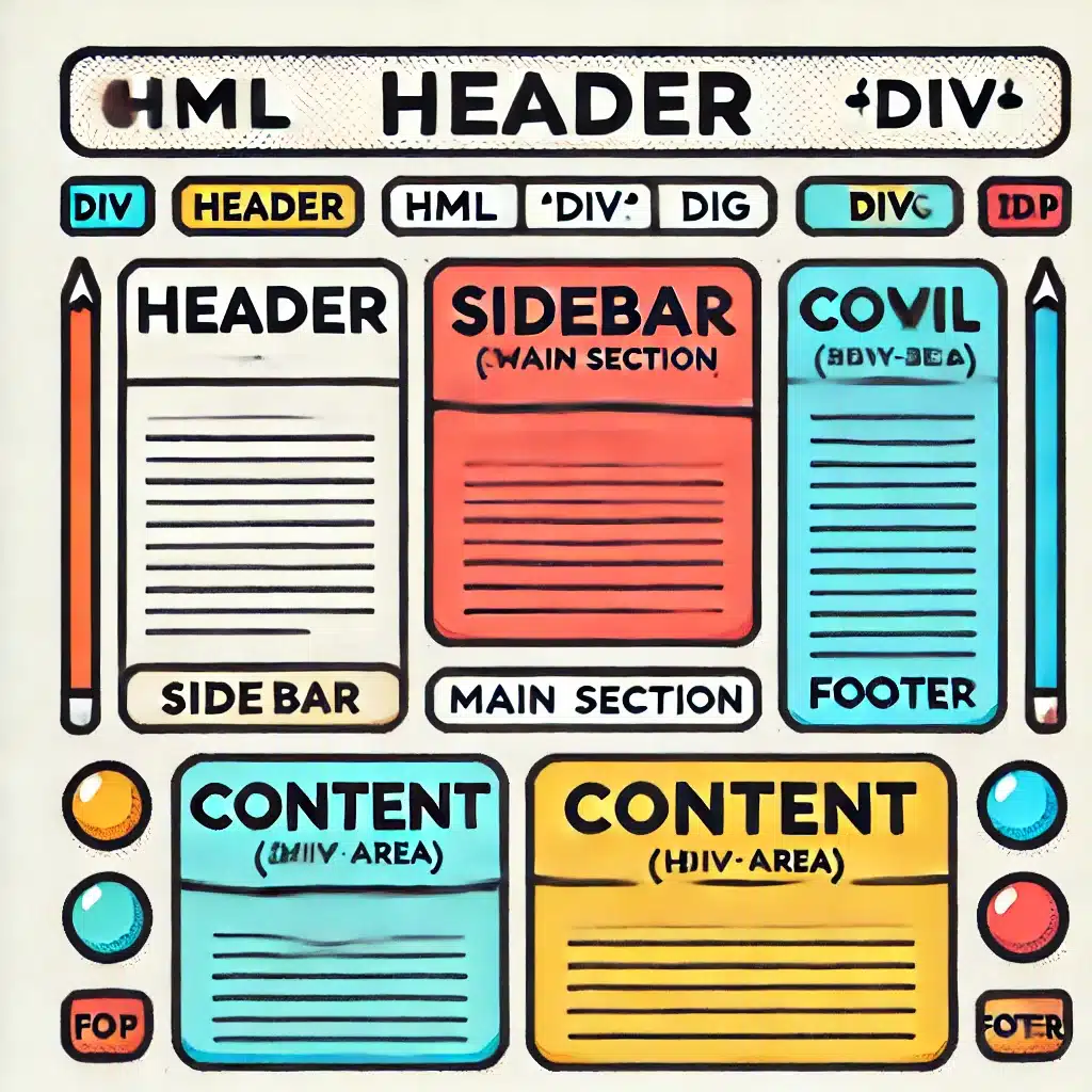
6. Common Use Cases of < div >
- Page Layouts: Structuring sections of a webpage like header, footer, sidebar, and main content.Example:
[/fusion_text][fusion_syntax_highlighter theme=”” language=”html” line_numbers=”” line_wrapping=”” copy_to_clipboard=”” copy_to_clipboard_text=”” hide_on_mobile=”small-visibility,medium-visibility,large-visibility” class=”” id=”” font_size=”” border_size=”” border_color=”” hue=”” saturation=”” lightness=”” alpha=”” border_style=”” background_color=”” line_number_background_color=”” line_number_text_color=”” margin_top=”” margin_right=”” margin_bottom=”” margin_left=””]PGRpdiBpZD0iaGVhZGVyIj5IZWFkZXIgU2VjdGlvbjwvZGl2Pgo8ZGl2IGlkPSJjb250ZW50Ij5NYWluIENvbnRlbnQgU2VjdGlvbjwvZGl2Pgo8ZGl2IGlkPSJmb290ZXIiPkZvb3RlciBTZWN0aW9uPC9kaXY+[/fusion_syntax_highlighter][fusion_text columns=”” column_min_width=”” column_spacing=”” rule_style=”” rule_size=”” rule_color=”” hue=”” saturation=”” lightness=”” alpha=”” user_select=”” content_alignment_medium=”” content_alignment_small=”” content_alignment=”” hide_on_mobile=”small-visibility,medium-visibility,large-visibility” sticky_display=”normal,sticky” class=”” id=”” margin_top=”” margin_right=”” margin_bottom=”” margin_left=”” fusion_font_family_text_font=”” fusion_font_variant_text_font=”” font_size=”” line_height=”” letter_spacing=”” text_transform=”” text_color=”” animation_type=”” animation_direction=”left” animation_color=”” animation_speed=”0.3″ animation_delay=”0″ animation_offset=”” logics=””]
- Containers for Styling: Grouping elements for applying consistent styles.
- JavaScript Manipulation: Wrapping elements inside a div allows JavaScript to manipulate all of them at once, such as showing/hiding a section of the page.
7. Difference Between < div > and Other HTML Elements
The < div > tag is a general-purpose container, while other HTML elements (like < section >, < article >, < header >, etc.) have specific meanings and should be used where semantics matter.
For example, prefer < header > for the top section of a page and < article > for an independent piece of content.
Example 5: Using a < section > instead of a < div >
[/fusion_text][fusion_syntax_highlighter theme=”” language=”html” line_numbers=”” line_wrapping=”” copy_to_clipboard=”” copy_to_clipboard_text=”” hide_on_mobile=”small-visibility,medium-visibility,large-visibility” class=”” id=”” font_size=”” border_size=”” border_color=”” hue=”” saturation=”” lightness=”” alpha=”” border_style=”” background_color=”” line_number_background_color=”” line_number_text_color=”” margin_top=”” margin_right=”” margin_bottom=”” margin_left=””]PHNlY3Rpb24+CiAgPGgxPlNlY3Rpb24gVGl0bGU8L2gxPgogIDxwPlNvbWUgY29udGVudCBpbnNpZGUgdGhlIHNlY3Rpb24uPC9wPgo8L3NlY3Rpb24+Cg==[/fusion_syntax_highlighter][fusion_text columns=”” column_min_width=”” column_spacing=”” rule_style=”” rule_size=”” rule_color=”” hue=”” saturation=”” lightness=”” alpha=”” user_select=”” content_alignment_medium=”” content_alignment_small=”” content_alignment=”” hide_on_mobile=”small-visibility,medium-visibility,large-visibility” sticky_display=”normal,sticky” class=”” id=”” margin_top=”” margin_right=”” margin_bottom=”” margin_left=”” fusion_font_family_text_font=”” fusion_font_variant_text_font=”” font_size=”” line_height=”” letter_spacing=”” text_transform=”” text_color=”” animation_type=”” animation_direction=”left” animation_color=”” animation_speed=”0.3″ animation_delay=”0″ animation_offset=”” logics=””]
In this case, using a < section > provides semantic meaning, which can be useful for accessibility and SEO.
8. Final Assignment
Task: Create a simple webpage using the < div > tag to structure the layout and apply basic styling.
- Create a layout with three sections: a header, main content area, and footer.
- The main content area should be split into two columns using Flexbox: a sidebar and a content section.
- Style the header, footer, sidebar, and content area with different background colors.
- Make sure the layout is responsive, so the sidebar stacks on top of the content area on smaller screens.
HTML Structure Example
[/fusion_text][fusion_syntax_highlighter theme=”” language=”html” line_numbers=”” line_wrapping=”” copy_to_clipboard=”” copy_to_clipboard_text=”” hide_on_mobile=”small-visibility,medium-visibility,large-visibility” class=”” id=”” font_size=”” border_size=”” border_color=”” hue=”” saturation=”” lightness=”” alpha=”” border_style=”” background_color=”” line_number_background_color=”” line_number_text_color=”” margin_top=”” margin_right=”” margin_bottom=”” margin_left=””]PCFET0NUWVBFIGh0bWw+CjxodG1sIGxhbmc9ImVuIj4KPGhlYWQ+CiAgPG1ldGEgY2hhcnNldD0iVVRGLTgiPgogIDxtZXRhIG5hbWU9InZpZXdwb3J0IiBjb250ZW50PSJ3aWR0aD1kZXZpY2Utd2lkdGgsIGluaXRpYWwtc2NhbGU9MS4wIj4KICA8dGl0bGU+RGl2IExheW91dCBFeGFtcGxlPC90aXRsZT4KICA8c3R5bGU+CiAgICBib2R5IHsKICAgICAgZm9udC1mYW1pbHk6IEFyaWFsLCBzYW5zLXNlcmlmOwogICAgICBtYXJnaW46IDA7CiAgICB9CiAgICAjaGVhZGVyIHsKICAgICAgYmFja2dyb3VuZC1jb2xvcjogIzRDQUY1MDsKICAgICAgY29sb3I6IHdoaXRlOwogICAgICB0ZXh0LWFsaWduOiBjZW50ZXI7CiAgICAgIHBhZGRpbmc6IDEwcHggMDsKICAgIH0KICAgICNmb290ZXIgewogICAgICBiYWNrZ3JvdW5kLWNvbG9yOiAjMzMzOwogICAgICBjb2xvcjogd2hpdGU7CiAgICAgIHRleHQtYWxpZ246IGNlbnRlcjsKICAgICAgcGFkZGluZzogMTBweCAwOwogICAgICBwb3NpdGlvbjogYWJzb2x1dGU7CiAgICAgIHdpZHRoOiAxMDAlOwogICAgICBib3R0b206IDA7CiAgICB9CiAgICAjbWFpbiB7CiAgICAgIGRpc3BsYXk6IGZsZXg7CiAgICAgIGZsZXgtZGlyZWN0aW9uOiByb3c7CiAgICAgIG1pbi1oZWlnaHQ6IDQwMHB4OwogICAgfQogICAgI3NpZGViYXIgewogICAgICBiYWNrZ3JvdW5kLWNvbG9yOiAjZjRmNGY0OwogICAgICBwYWRkaW5nOiAyMHB4OwogICAgICBmbGV4OiAxOwogICAgfQogICAgI2NvbnRlbnQgewogICAgICBiYWNrZ3JvdW5kLWNvbG9yOiAjZmZmOwogICAgICBwYWRkaW5nOiAyMHB4OwogICAgICBmbGV4OiAzOwogICAgfQogICAgQG1lZGlhIChtYXgtd2lkdGg6IDc2OHB4KSB7CiAgICAgICNtYWluIHsKICAgICAgICBmbGV4LWRpcmVjdGlvbjogY29sdW1uOwogICAgICB9CiAgICB9CiAgPC9zdHlsZT4KPC9oZWFkPgo8Ym9keT4KCiAgPGRpdiBpZD0iaGVhZGVyIj4KICAgIDxoMT5NeSBXZWJzaXRlPC9oMT4KICA8L2Rpdj4KCiAgPGRpdiBpZD0ibWFpbiI+CiAgICA8ZGl2IGlkPSJzaWRlYmFyIj4KICAgICAgPGgyPlNpZGViYXI8L2gyPgogICAgICA8cD5UaGlzIGlzIHRoZSBzaWRlYmFyIGNvbnRlbnQuPC9wPgogICAgPC9kaXY+CiAgICA8ZGl2IGlkPSJjb250ZW50Ij4KICAgICAgPGgyPk1haW4gQ29udGVudDwvaDI+CiAgICAgIDxwPlRoaXMgaXMgdGhlIG1haW4gY29udGVudCBhcmVhLjwvcD4KICAgIDwvZGl2PgogIDwvZGl2PgoKICA8ZGl2IGlkPSJmb290ZXIiPgogICAgPHA+Rm9vdGVyIFNlY3Rpb248L3A+CiAgPC9kaXY+Cgo8L2JvZHk+CjwvaHRtbD4K[/fusion_syntax_highlighter][fusion_text columns=”” column_min_width=”” column_spacing=”” rule_style=”” rule_size=”” rule_color=”” hue=”” saturation=”” lightness=”” alpha=”” user_select=”” content_alignment_medium=”” content_alignment_small=”” content_alignment=”” hide_on_mobile=”small-visibility,medium-visibility,large-visibility” sticky_display=”normal,sticky” class=”” id=”” margin_top=”” margin_right=”” margin_bottom=”” margin_left=”” fusion_font_family_text_font=”” fusion_font_variant_text_font=”” font_size=”” line_height=”” letter_spacing=”” text_transform=”” text_color=”” animation_type=”” animation_direction=”left” animation_color=”” animation_speed=”0.3″ animation_delay=”0″ animation_offset=”” logics=””]
9. Answer Key for the Assignment
- Header, Footer, and Main Layout:
- Header and footer are styled with background colors and centered text.
- The main layout uses Flexbox to create a two-column layout for the sidebar and content.
- Flexbox for Responsive Design:
- On smaller screens, the
@media query ensures that the sidebar and content stack vertically, providing a mobile-friendly layout.
- Additional Styling:
- Padding is added for better spacing, and the background colors visually differentiate the sections.
Next Steps
a. Practice by creating different layouts using < div > and CSS Grid.
b. Add some interactivity using JavaScript, like showing/hiding sections.
[/fusion_text][fusion_text columns=”” column_min_width=”” column_spacing=”” rule_style=”” rule_size=”” rule_color=”” hue=”” saturation=”” lightness=”” alpha=”” user_select=”” content_alignment_medium=”” content_alignment_small=”” content_alignment=”center” hide_on_mobile=”small-visibility,medium-visibility,large-visibility” sticky_display=”normal,sticky” class=”” id=”” margin_top=”50px” margin_right=”” margin_bottom=”” margin_left=”” fusion_font_family_text_font=”” fusion_font_variant_text_font=”” font_size=”” line_height=”” letter_spacing=”” text_transform=”” text_color=”” animation_type=”” animation_direction=”left” animation_color=”” animation_speed=”0.3″ animation_delay=”0″ animation_offset=”” logics=””]
[/fusion_text][fusion_youtube id=”https://www.youtube.com/watch?v=WbnCll6vvw4″ alignment=”center” width=”” height=”” start_time=”” end_time=”” autoplay=”false” mute=”false” loop=”false” controls=”true” api_params=”” title_attribute=”” video_facade=”” thumbnail_size=”auto” margin_top=”50px” margin_bottom=”50px” hide_on_mobile=”small-visibility,medium-visibility,large-visibility” class=”” css_id=”” structured_data=”off” video_upload_date=”” video_duration=”” video_title=”” video_desc=”” /][fusion_text columns=”” column_min_width=”” column_spacing=”” rule_style=”” rule_size=”” rule_color=”” hue=”” saturation=”” lightness=”” alpha=”” user_select=”” content_alignment_medium=”” content_alignment_small=”” content_alignment=”” hide_on_mobile=”small-visibility,medium-visibility,large-visibility” sticky_display=”normal,sticky” class=”” id=”” margin_top=”50px” margin_right=”” margin_bottom=”” margin_left=”” fusion_font_family_text_font=”” fusion_font_variant_text_font=”” font_size=”” line_height=”” letter_spacing=”” text_transform=”” text_color=”” animation_type=”” animation_direction=”left” animation_color=”” animation_speed=”0.3″ animation_delay=”0″ animation_offset=”” logics=””]
Related Videos:

Related Posts:
Optimizing Unity Editor Layout for Enhanced Game Development Workflow
Tutorial #12: Using WordPress Widgets
Using CSS classes and the class attribute
Android Studio: The Official IDE for Android Development
HTML, CSS, & JavaScript: Essentials of Web Development
[/fusion_text][/fusion_builder_column][/fusion_builder_row][/fusion_builder_container]